(EM® — ARTICLE)

Written by
ELKIN MENDOZAPosted on
07/01/24
Share:
• 11 MIN READ
• POSTED ON 07/01/24
How I used Devin + Figma MCP to build Harmony, a one-way token design system with agentic context routing that translates Figma specs into React, Next.js, and React Native code.
RELATED TOPICS
The starting point: a design system built to ship from Figma to React, Next.js, and React Native without manual translation.
01
INTRODUCTION
In the past, I have worked with primitives, semantic tokens, and Figma specifications across multiple projects. The vocabulary isn't unfamiliar to me — the process of separating raw values from design intent, maintaining a one-way token flow, and writing component specs that can be used across various frameworks.
What I hadn't done before was whipping up an agentic context system around it. With Harmony — an open-source design system inspired by my Portfolio Template — I wanted to test the moment at which I stop treating an AI agent as a chat assistant and start treating it as part of my front-end architecture, giving it structured context about the reason it exists, its scope, personality, color usage, visual principles, typography, Figma specifications, and other important details so it can handle the translation while I focus on brand identity, design patterns, and the decisions that actually shape the product.
EDITORIAL SIGNAL
"An AI agent is not a magical translator. It's more like a very fast, ultra-intelligent workaholic colleague. If the instructions are vague, it does exactly the wrong thing very quickly."
02
FOUNDATION
The token architecture wasn't the experiment — it was the baseline.
Primitives hold the raw Figma values: brand.500 is the orange, neutral.50 is the warm cream. Semantic tokens express intent: background.primary, content.onBrand, status.negative. Component tokens scope decisions to specific UI elements. Generated CSS bridges it all into Tailwind v4.
One direction. Never reversed. I've used this pattern before. I wanted to see if the agent could work alongside with me in the workflow, not replace, and free up the time I was still spending on the repetitive translation between Figma and code?
FLOW
Token flow
Figma → primitives → semantic → component tokens → generated CSS → code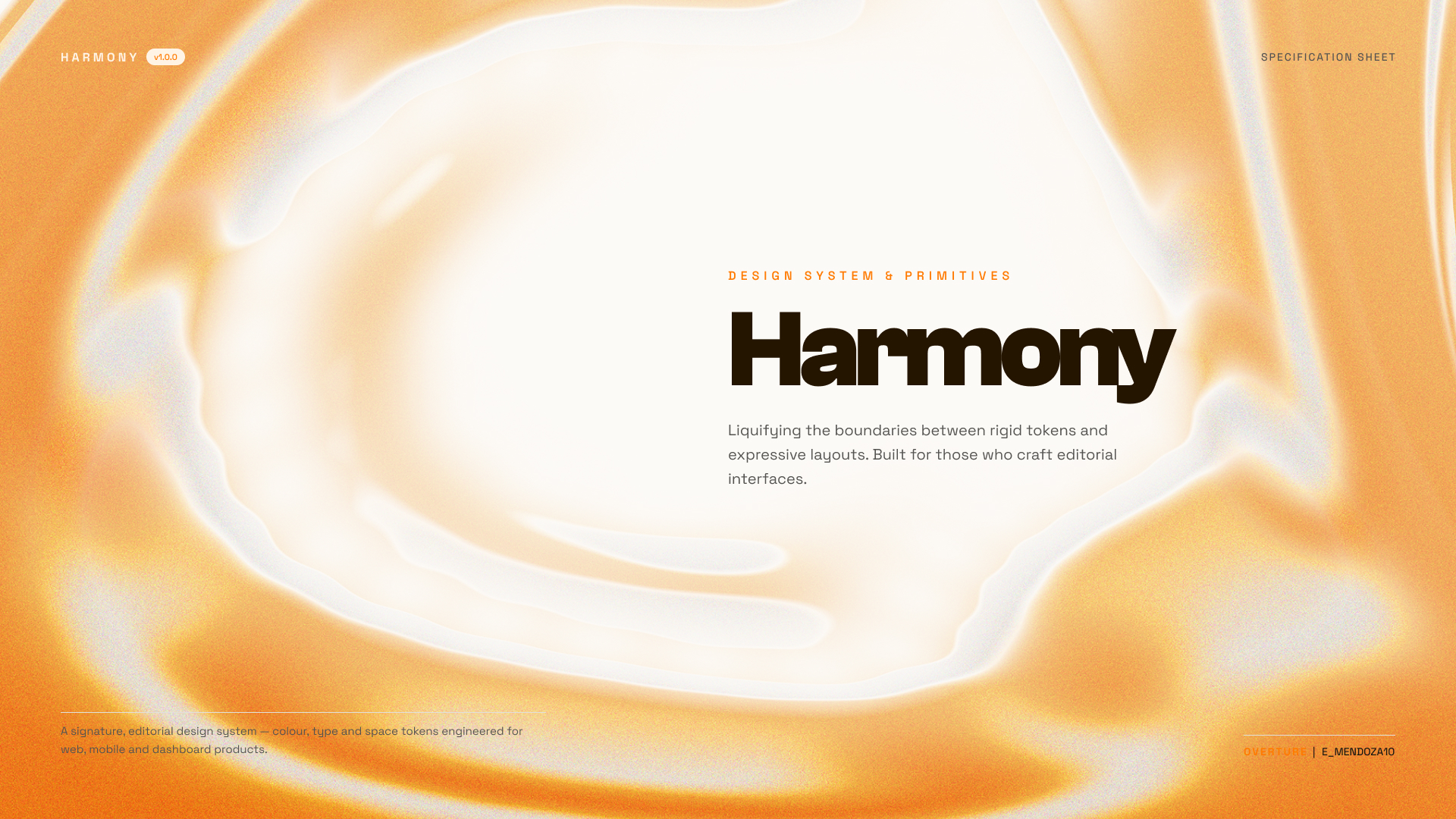
Before: the Figma spec. Every variable name has to survive the trip into code.
After: the generated Tailwind v4 theme file the agent produced from the same source.
03
AGENTIC TRANSLATION
Handing the translation to an AI agent.
I started using Devin — an AI coding agent — with the Figma MCP, which lets it pull variables directly from my Figma file. No screenshots. No copy-pasting hex codes into messages. The agent reads the actual Figma variables, checks them against committed tokens, and generates the CSS.
The first sessions were chaos. I'd ask it to update a token, and it would load 40 files, get overwhelmed, and invent variable names. I'd ask it to build a component, and it would reference documentation examples that didn't match the actual generated output. The fix wasn't better prompts. It was better front-end architecture.
WORKFLOW
AGENTS.md — Figma MCP Workflow
## 5. Figma MCP Workflow (design-to-foundation)

Standard operating procedure whenever a spec arrives from Figma:

1. Identify the node — get file key + node id from the Figma URL.
2. `get_variable_defs` — pull variables for the node (colors, spacing, type).
3. Reconcile against `/tokens/primitives.json`; add missing primitives.
4. Map new values to semantic tokens (never leave raw values in components).
5. `get_design_context` — pull reference code + screenshot for structure.
6. Generate `/foundations/theme.css` and any changed `/tokens/*.json`.
7. Build/adapt components against semantic + component tokens only.
8. Prepare Code Connect so the Figma component maps to Vue/React/RN source.
9. Verify contrast (WCAG AA) and that every token yields a Tailwind utility.

Rules for MCP usage:
- Prefer `get_variable_defs` and `get_design_context` over guessing from images.
- Do not fabricate node ids; request a node-specific URL if missing.
- Treat MCP output as reference to adapt, not paste verbatim.
04
CONTEXT
The fix wasn't better prompts. It was better front-end architecture.
I wrote a file called CONTEXT.md, which is a retrieval router. For each type of task, it tells the agent exactly which files to load and which to ignore. Pulling a Figma spec? Load the design-to-token skill and the Figma workflow rules. Adding a semantic token? Load the token files and naming conventions. Building a component? Load the component skill and the component tokens. Nothing else.
That one file — a routing table for context — turned unpredictable sessions into reliable ones. I spent more time writing it than writing any prompt. it was a bit tedious since i love building process and getting right into things but it was totally the most valuable time spent because it meant I could trust the agent with the translation work and focus on the design work.
ROUTER
CONTEXT.md
# Harmony — Context Index (RAG / Retrieval Map)

## 1. Task → Context routing table

| Task type                        | Load (in order)                                     | Do NOT load           |
| -------------------------------- | --------------------------------------------------- | --------------------- |
| Pull design spec from Figma      | `AGENTS.md` §5, `design-to-token/SKILL.md`          | components/, SKILL.md |
| Add / edit a token               | `AGENTS.md` §1–3, `tokens/primitives.json`          | components/           |
| Regenerate `theme.css`           | `AGENTS.md` §4, `tokens/*.json`, `docs-sync/SKILL`  | SKILL.md, README      |
| Build a component in code        | `AGENTS.md` §7, `tokens/components.json`            | inspirations/         |
| Design a component in Figma      | `SKILL.md` §5, `docs/FIGMA-CONFIG.md`               | dependencies.md       |

## 2. Source-of-truth precedence

1. Figma Variables (live via MCP `get_variable_defs`)
2. `tokens/primitives.json` (committed export — immutable in code)
3. `tokens/semantic.json` (intent aliases)
4. `tokens/components.json` (component-scoped tokens)
5. `foundations/theme.css` (GENERATED)
6. Anything hardcoded in a component → treat as a bug
05
BREAKDOWN
Two things that broke.
My folder names broke the agent. I'd organised procedures under .devin/workflows/. The platform convention changed to .devin/skills/. Thirty-eight references across twelve files pointed nowhere. The agent didn't complain — it just silently failed. A human would have figured it out. The agent needed every path to be exact. It taught me that in a token-driven system, naming isn't a label — it's a contract between the Figma spec and the generated code.
My documentation lied. Example token names in my docs showed --text-l-regular-size. The pipeline actually generated --text-xl-size. The agent treated the docs as the specification and wrote code against names that didn't exist. The generated CSS was fine. The docs were the bug. In a system built on communication between Figma and code, your documentation is the specification — not a summary of it.
06
AGENTS
The agent's operating guide came from AGENTS.md.
While CONTEXT.md decides what to load, AGENTS.md decides how to behave. It defines the mission, the design signature, the canonical colour palette, the token architecture, the Tailwind v4 foundation rules, and the Figma MCP workflow. It also sets guardrails: the agent must never invent primitive values, never reverse the token flow, and never hardcode values in components.
The most important guardrail is source-of-truth precedence. When a Figma variable, a primitive JSON value, and a semantic alias all exist, the agent knows exactly which one wins. That single rule stops the agent from drifting when it sees conflicting examples across the repo.
GUIDE
01
Harmony now has six colour families on a 50-to-950 scale, semantic tokens for light and dark mode, and a generated Tailwind v4 @theme file.
02
The monorepo delivers to Next.js 15 for web and Expo 53 + React Native for mobile — same exact token source, different runtimes.
03
Sixteen component specifications describe props, states, and variants in a framework-agnostic manner, ready for Code Connect.
The diagram I kept next to my monitor while training myself to name sources, not outputs.
07
WORKFLOWS
The skills are the repeatable procedures.
Each workflow is documented as a Markdown skill in .devin/skills/. The agent reads the skill for the task, follows the steps, and checks the guardrails. Two skills run the whole pipeline: design-to-token for pulling Figma specs into tokens, and design-language-sync for propagating a change in docs/DESIGN.md through tokens, rules, and generated CSS.
There's also a WORKFLOWS.md for human operators. It has the exact prompt templates to paste into the agent chat, the one-way flow diagram, the trigger reference table, and a verification checklist. It stops you from accidentally breaking the source chain by asking the agent to edit theme.css directly.
WORKFLOWS
docs/WORKFLOWS.md
## 1. Golden rule before every prompt

Never say *"update theme.css"*. Always say **which source changed** and ask the
agent to **propagate from that source**. Agents must follow the one-way flow:

```
Figma / primitives -> tokens/semantic.json -> tokens/components.json -> code
                            |
                            v
                  foundations/theme.css  (last, mirrors semantic.json)
```

If you ask an agent to edit `theme.css` directly, you will break the source chain.

## 5. Verification checklist

```
Confirm:
1. Only the correct source file(s) were edited first.
2. foundations/theme.css is a mirror of tokens/semantic.json.
3. No primitive values were invented.
4. docs/DESIGN.md, docs/README.md, and AGENTS.md are updated only if a
   brand/visual/scope change occurred.
5. The changelog in docs/DESIGN.md §10 was bumped.
```
08
COMPONENTS
Building components across three frameworks.
The component-build skill turns a Figma component set into production components. The prop contract is identical across Vue, React, and React Native. The only thing that changes is the implementation layer: Tailwind v4 utilities for web, StyleSheet token objects for mobile. Every component ships all states — default, hover, focus, active, disabled, loading, error — plus an accessibility pass.
09
REPO SCAFFOLD
The repo is the centralised scaffold.
Every file has a role and a precedence. docs/DESIGN.md is human intent. tokens/primitives.json is the Figma export. tokens/semantic.json is intent. foundations/theme.css is generated. The agent maintains this structure; it must not scatter tokens or duplicate foundations elsewhere.
SCAFFOLD
AGENTS.md — Repository scaffold
## 6. Repository Scaffold (centralised baseline)

```
Harmony/
├── CONTEXT.md                ← retrieval router (read FIRST)
├── AGENTS.md                 ← this file (agentic operating guide)
├── SKILL.md                  ← Figma AI / MCP design skill
├── .devin/
│   ├── rules/                ← auto-applied constraints
│   │   ├── harmony-core.md   ← always-on constitution
│   │   ├── tokens.md         ← token layer + naming
│   │   ├── figma-mcp.md      ← Figma read/write rules
│   │   ├── dependencies.md   ← stack/version rules
│   │   └── accessibility.md  ← a11y requirements
│   └── skills/               ← repeatable procedures
│       ├── design-to-token/SKILL.md
│       ├── component-build/SKILL.md
│       ├── code-connect/SKILL.md
│       ├── design-language-sync/SKILL.md
│       ├── docs-sync/SKILL.md
│       └── template-build/SKILL.md
├── tokens/
│   ├── primitives.json       ← exported Figma primitives (immutable)
│   ├── semantic.json         ← intent aliases (authored here)
│   └── components.json       ← component-scoped tokens
├── foundations/
│   ├── theme.css             ← GENERATED Tailwind v4 @theme
│   └── reset.css             ← base/reset layer
├── components/               ← framework-agnostic specs + Code Connect
├── packages/                 ← monorepo: web (Next.js) + mobile (Expo/RN)
│   ├── web/                  ← Next.js 15 + Tailwind v4
│   └── mobile/               ← Expo 53 + React Native 0.79
└── docs/
    ├── DESIGN.md             ← design-language foundation
    ├── WORKFLOWS.md          ← human prompt templates
    └── FIGMA-CONFIG.md       ← canonical Figma structure
```
10
The generated CSS is the bridge between the Figma spec and the codebase.
The foundations/theme.css file is generated from tokens/primitives.json and tokens/semantic.json. It exposes every colour step as a Tailwind v4 theme variable, with color-mix and var() references kept intact. No hand-editing. No drift.
THEME
foundations/theme.css
@import "tailwindcss";

@theme {
  /* --- brand (orange) --- */
  --color-brand-50:  #fff4e5;
  --color-brand-500: #ff9500;
  --color-brand-950: #241500;

  /* --- neutral (warm gray) --- */
  --color-neutral-50:  #f8f7f5;
  --color-neutral-500: #787470;
  --color-neutral-950: #0d0c0a;

  /* --- green (success) --- */
  --color-green-500: #1a9e52;

  /* --- red (error) --- */
  --color-red-500: #e53e2a;

  /* --- semantic (light) --- */
  --color-background-primary: var(--color-neutral-50);
  --color-content-primary:    var(--color-neutral-900);
  --color-border-subtle:      var(--color-neutral-200);
}

@media (prefers-color-scheme: dark) {
  @theme { /* semantic dark overrides only */ }
}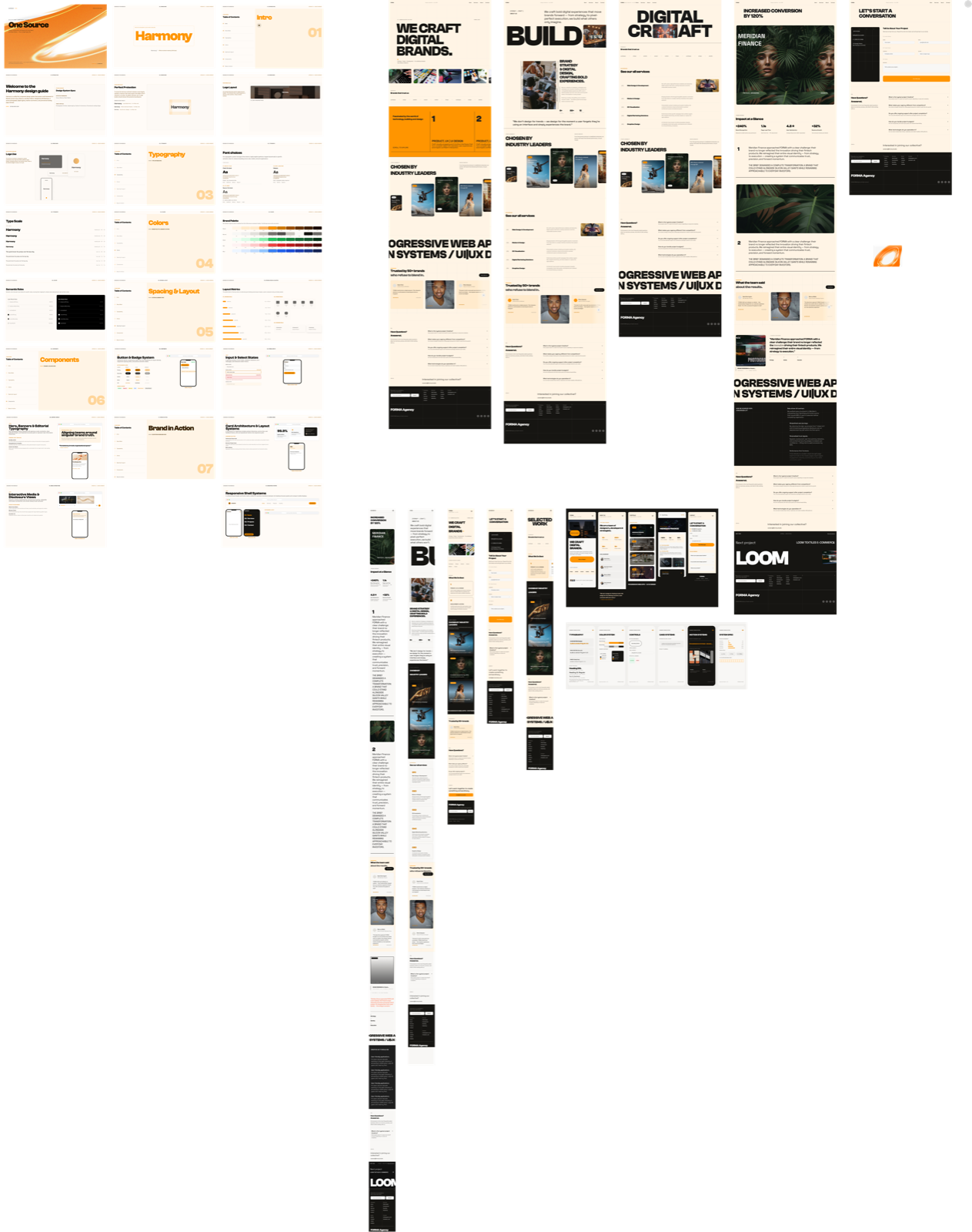
Same token source, three page types. I still catch myself checking each one by hand.
11
LESSONS
What I learned and what I'd pass on.
Learn the vocabulary. Primitives and semantics aren't developer terms. They're design concepts expressed in a language code can comprehend. Understanding them didn't make me any more technical — it made my design decisions more precise and easier to communicate with the AI and other team members.
Architect the context before you prompt. A retrieval router, a naming convention, a typography system, accessibility rules, a one-way token flow, the constraints, and so on. These aren't configuration overhead. They're the front-end architecture that lets the AI agent do useful work instead of guessing.
AI doesn't replace your design thinking. It replaced the hours I spent typing #ff9500. It didn't replace the decision to make that orange the brand anchor. The intent — the brand identity, the patterns, the specifications — is still yours.
"Building Harmony confirmed something I'd suspected but never tested at this scale: the real leverage in UI development isn't writing more code — it's writing better context. The primitives, the semantics, the Figma specifications, the retrieval router — these aren't just files in a repo. They're the architecture that lets a human and an AI agent collaborate seamlessly on the same system without stepping on each other."
"Building Harmony confirmed something I'd suspected but never tested at this scale: the real leverage in UI development isn't writing more code — it's writing better context. The primitives, the semantics, the Figma specifications, the retrieval router — these aren't just files in a repo. They're the architecture that lets a human and an AI agent collaborate seamlessly on the same system without stepping on each other."
12
TEMPLATES
What you can build with the same token source.
The real test of a design system is whether it can produce different surfaces without breaking. Harmony's tokens are designed to scale across three template families:
Editorial / portfolio sites — big Clash Grotesk titles, generous whitespace, media-rich sections. This is where the EM Mendoza brand lives: confident, gallery-like, story-driven.
Dashboards and admin tools — the same colour and spacing tokens become compact tables, controls, status chips, and data-dense cards. The neutral palette stays calm while the brand orange carries meaning.
Mobile apps — React Native with the same props and token objects, not CSS variables. Touch-first, compact density, identical brand expression.
The target audience isn't one industry. It's any organisation that leads with a strong visual voice: fintech needing trust, creative & event brands needing expression, public sector needing accessibility, and cultural organisations needing bold, gallery-like presence. The token layer stays the same; the templates change.
Watch how the same Harmony token foundation scales across a fintech dashboard, a creative event site, a public-sector portal, and a mobile app — all from one Figma source. This walkthrough shows what becomes possible when design intent is encoded as primitives, semantic tokens, and component-level decisions that compile to React, Next.js, and React Native.
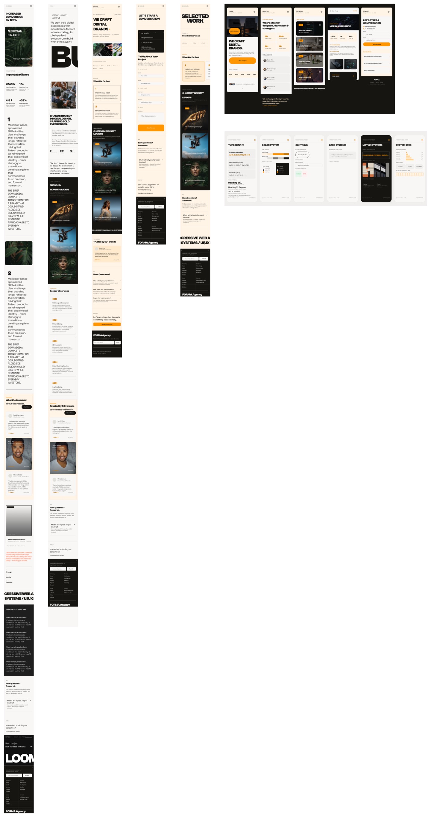
Mobile templates and component screens built from the same Harmony token layer using agentic design-to-code workflows.
13
CASE STUDY
From one prompt to a full brand surface.
This VELO-NOIR e-commerce kit is an example of what the Harmony workflow can produce when context is treated as architecture. I used the same primitives, semantic tokens, and component patterns described in this article — primitives, semantic, component tokens, the one-way Figma-to-code flow, and the agentic context from CONTEXT.md and AGENTS.md — to describe the intent in plain language. The agent then generated a cohesive set of pages: landing, product detail, collection, editorial, contact, and checkout components. No hardcoded values, no drift between Figma and code. The same token source produced the dark palette, the spacing rhythm, the type scale, and the reusable card and form patterns.
The process followed the same three skills described earlier: design-to-token to extract Figma variables, design-language-sync to propagate changes across tokens and docs, and component-build to turn the Figma component set into React/Next.js markup. The result is a production-ready direction that a developer can hand off or extend without reverse-engineering the design.
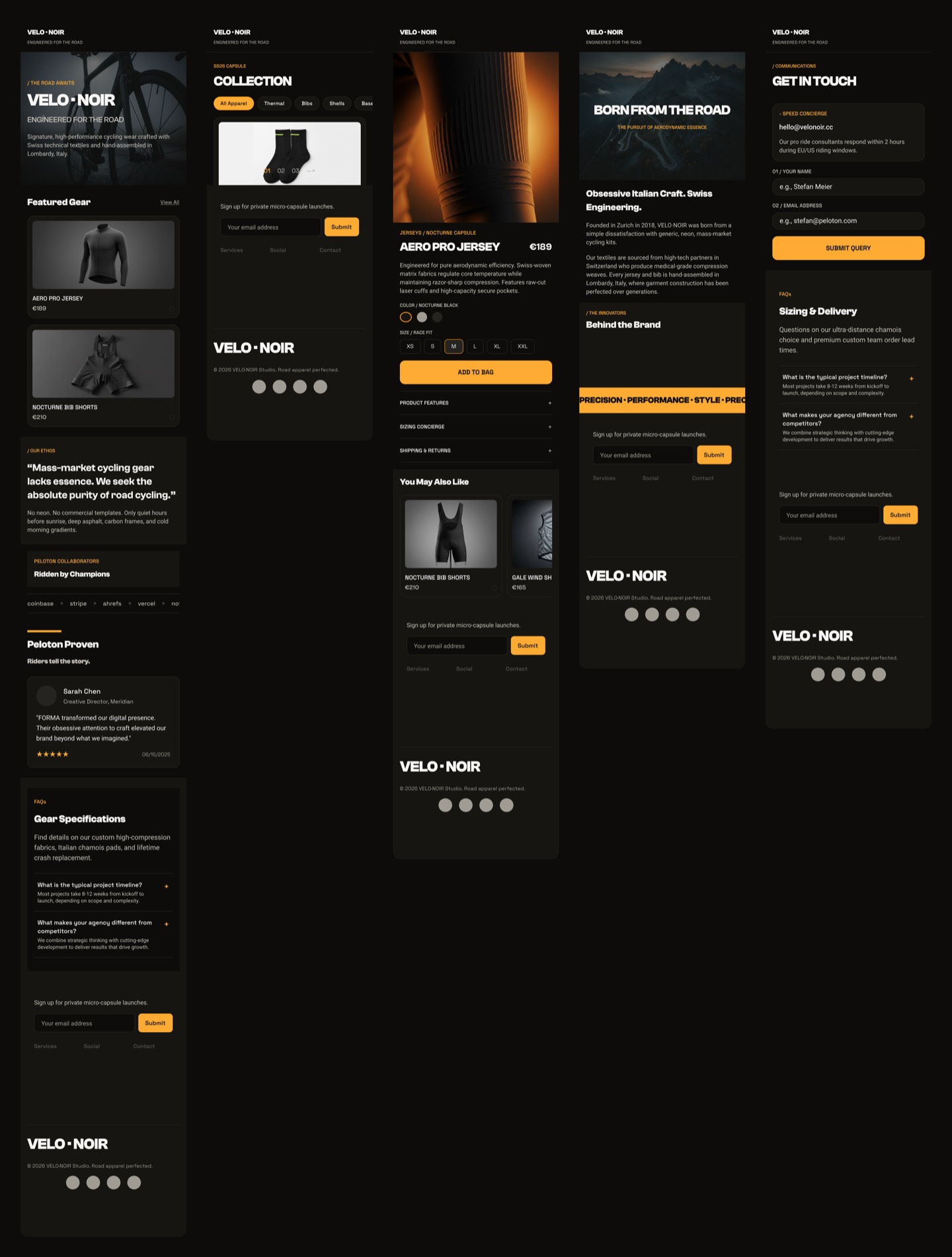
VELO-NOIR e-commerce template generated from the Harmony token layer through the Figma + Claude agentic workflow.
14
CONCLUSION
What comes next.
Agentic context engineering is just one step. I want to dive deeper into AI and machine learning — to become also a multifaceted data scientist, but to understand how data analysis can inform design decisions, how machine learning can detect token drift or accessibility regressions, and how these disciplines feed back into the kind of front-end architecture I've been building. I don't have all the answers yet, but I'm actively pursuing them.
Harmony is in progress. The foundation is live. Next: building the full template cases from Figma into production React and React Native, with Code Connect mapping every Figma component to its code source. If you want to see more of how I work — or other experiments like this one — visit my about page or the playground.
LINKS
Explore the system: the Harmony Design System is on Figma Community, and the repo is open at github.com/elkinmendoza/Harmony-Design.
CLOSING NOTE
• 11 MIN READ
• 07/01/24
How I used Devin + Figma MCP to build Harmony, a one-way token design system with agentic context routing that translates Figma specs into React, Next.js, and React Native code.
RELATED TOPICS
The starting point: a design system built to ship from Figma to React, Next.js, and React Native without manual translation.
01
INTRODUCTION
In the past, I have worked with primitives, semantic tokens, and Figma specifications across multiple projects. The vocabulary isn't unfamiliar to me — the process of separating raw values from design intent, maintaining a one-way token flow, and writing component specs that can be used across various frameworks.
What I hadn't done before was whipping up an agentic context system around it. With Harmony — an open-source design system inspired by my Portfolio Template — I wanted to test the moment at which I stop treating an AI agent as a chat assistant and start treating it as part of my front-end architecture, giving it structured context about the reason it exists, its scope, personality, color usage, visual principles, typography, Figma specifications, and other important details so it can handle the translation while I focus on brand identity, design patterns, and the decisions that actually shape the product.
EDITORIAL SIGNAL
"An AI agent is not a magical translator. It's more like a very fast, ultra-intelligent workaholic colleague. If the instructions are vague, it does exactly the wrong thing very quickly."
02
FOUNDATION
The token architecture wasn't the experiment — it was the baseline.
Primitives hold the raw Figma values: brand.500 is the orange, neutral.50 is the warm cream. Semantic tokens express intent: background.primary, content.onBrand, status.negative. Component tokens scope decisions to specific UI elements. Generated CSS bridges it all into Tailwind v4.
One direction. Never reversed. I've used this pattern before. I wanted to see if the agent could work alongside with me in the workflow, not replace, and free up the time I was still spending on the repetitive translation between Figma and code?
FLOW
Token flow
Figma → primitives → semantic → component tokens → generated CSS → codeBefore: the Figma spec. Every variable name has to survive the trip into code.
After: the generated Tailwind v4 theme file the agent produced from the same source.
03
AGENTIC TRANSLATION
Handing the translation to an AI agent.
I started using Devin — an AI coding agent — with the Figma MCP, which lets it pull variables directly from my Figma file. No screenshots. No copy-pasting hex codes into messages. The agent reads the actual Figma variables, checks them against committed tokens, and generates the CSS.
The first sessions were chaos. I'd ask it to update a token, and it would load 40 files, get overwhelmed, and invent variable names. I'd ask it to build a component, and it would reference documentation examples that didn't match the actual generated output. The fix wasn't better prompts. It was better front-end architecture.
WORKFLOW
AGENTS.md — Figma MCP Workflow
## 5. Figma MCP Workflow (design-to-foundation)

Standard operating procedure whenever a spec arrives from Figma:

1. Identify the node — get file key + node id from the Figma URL.
2. `get_variable_defs` — pull variables for the node (colors, spacing, type).
3. Reconcile against `/tokens/primitives.json`; add missing primitives.
4. Map new values to semantic tokens (never leave raw values in components).
5. `get_design_context` — pull reference code + screenshot for structure.
6. Generate `/foundations/theme.css` and any changed `/tokens/*.json`.
7. Build/adapt components against semantic + component tokens only.
8. Prepare Code Connect so the Figma component maps to Vue/React/RN source.
9. Verify contrast (WCAG AA) and that every token yields a Tailwind utility.

Rules for MCP usage:
- Prefer `get_variable_defs` and `get_design_context` over guessing from images.
- Do not fabricate node ids; request a node-specific URL if missing.
- Treat MCP output as reference to adapt, not paste verbatim.
04
CONTEXT
The fix wasn't better prompts. It was better front-end architecture.
I wrote a file called CONTEXT.md, which is a retrieval router. For each type of task, it tells the agent exactly which files to load and which to ignore. Pulling a Figma spec? Load the design-to-token skill and the Figma workflow rules. Adding a semantic token? Load the token files and naming conventions. Building a component? Load the component skill and the component tokens. Nothing else.
That one file — a routing table for context — turned unpredictable sessions into reliable ones. I spent more time writing it than writing any prompt. it was a bit tedious since i love building process and getting right into things but it was totally the most valuable time spent because it meant I could trust the agent with the translation work and focus on the design work.
ROUTER
CONTEXT.md
# Harmony — Context Index (RAG / Retrieval Map)

## 1. Task → Context routing table

| Task type                        | Load (in order)                                     | Do NOT load           |
| -------------------------------- | --------------------------------------------------- | --------------------- |
| Pull design spec from Figma      | `AGENTS.md` §5, `design-to-token/SKILL.md`          | components/, SKILL.md |
| Add / edit a token               | `AGENTS.md` §1–3, `tokens/primitives.json`          | components/           |
| Regenerate `theme.css`           | `AGENTS.md` §4, `tokens/*.json`, `docs-sync/SKILL`  | SKILL.md, README      |
| Build a component in code        | `AGENTS.md` §7, `tokens/components.json`            | inspirations/         |
| Design a component in Figma      | `SKILL.md` §5, `docs/FIGMA-CONFIG.md`               | dependencies.md       |

## 2. Source-of-truth precedence

1. Figma Variables (live via MCP `get_variable_defs`)
2. `tokens/primitives.json` (committed export — immutable in code)
3. `tokens/semantic.json` (intent aliases)
4. `tokens/components.json` (component-scoped tokens)
5. `foundations/theme.css` (GENERATED)
6. Anything hardcoded in a component → treat as a bug
05
BREAKDOWN
Two things that broke.
My folder names broke the agent. I'd organised procedures under .devin/workflows/. The platform convention changed to .devin/skills/. Thirty-eight references across twelve files pointed nowhere. The agent didn't complain — it just silently failed. A human would have figured it out. The agent needed every path to be exact. It taught me that in a token-driven system, naming isn't a label — it's a contract between the Figma spec and the generated code.
My documentation lied. Example token names in my docs showed --text-l-regular-size. The pipeline actually generated --text-xl-size. The agent treated the docs as the specification and wrote code against names that didn't exist. The generated CSS was fine. The docs were the bug. In a system built on communication between Figma and code, your documentation is the specification — not a summary of it.
06
AGENTS
The agent's operating guide came from AGENTS.md.
While CONTEXT.md decides what to load, AGENTS.md decides how to behave. It defines the mission, the design signature, the canonical colour palette, the token architecture, the Tailwind v4 foundation rules, and the Figma MCP workflow. It also sets guardrails: the agent must never invent primitive values, never reverse the token flow, and never hardcode values in components.
The most important guardrail is source-of-truth precedence. When a Figma variable, a primitive JSON value, and a semantic alias all exist, the agent knows exactly which one wins. That single rule stops the agent from drifting when it sees conflicting examples across the repo.
GUIDE
01
Harmony now has six colour families on a 50-to-950 scale, semantic tokens for light and dark mode, and a generated Tailwind v4 @theme file.
02
The monorepo delivers to Next.js 15 for web and Expo 53 + React Native for mobile — same exact token source, different runtimes.
03
Sixteen component specifications describe props, states, and variants in a framework-agnostic manner, ready for Code Connect.
The diagram I kept next to my monitor while training myself to name sources, not outputs.
07
WORKFLOWS
The skills are the repeatable procedures.
Each workflow is documented as a Markdown skill in .devin/skills/. The agent reads the skill for the task, follows the steps, and checks the guardrails. Two skills run the whole pipeline: design-to-token for pulling Figma specs into tokens, and design-language-sync for propagating a change in docs/DESIGN.md through tokens, rules, and generated CSS.
There's also a WORKFLOWS.md for human operators. It has the exact prompt templates to paste into the agent chat, the one-way flow diagram, the trigger reference table, and a verification checklist. It stops you from accidentally breaking the source chain by asking the agent to edit theme.css directly.
WORKFLOWS
docs/WORKFLOWS.md
## 1. Golden rule before every prompt

Never say *"update theme.css"*. Always say **which source changed** and ask the
agent to **propagate from that source**. Agents must follow the one-way flow:

```
Figma / primitives -> tokens/semantic.json -> tokens/components.json -> code
                            |
                            v
                  foundations/theme.css  (last, mirrors semantic.json)
```

If you ask an agent to edit `theme.css` directly, you will break the source chain.

## 5. Verification checklist

```
Confirm:
1. Only the correct source file(s) were edited first.
2. foundations/theme.css is a mirror of tokens/semantic.json.
3. No primitive values were invented.
4. docs/DESIGN.md, docs/README.md, and AGENTS.md are updated only if a
   brand/visual/scope change occurred.
5. The changelog in docs/DESIGN.md §10 was bumped.
```
08
COMPONENTS
Building components across three frameworks.
The component-build skill turns a Figma component set into production components. The prop contract is identical across Vue, React, and React Native. The only thing that changes is the implementation layer: Tailwind v4 utilities for web, StyleSheet token objects for mobile. Every component ships all states — default, hover, focus, active, disabled, loading, error — plus an accessibility pass.
09
REPO SCAFFOLD
The repo is the centralised scaffold.
Every file has a role and a precedence. docs/DESIGN.md is human intent. tokens/primitives.json is the Figma export. tokens/semantic.json is intent. foundations/theme.css is generated. The agent maintains this structure; it must not scatter tokens or duplicate foundations elsewhere.
SCAFFOLD
AGENTS.md — Repository scaffold
## 6. Repository Scaffold (centralised baseline)

```
Harmony/
├── CONTEXT.md                ← retrieval router (read FIRST)
├── AGENTS.md                 ← this file (agentic operating guide)
├── SKILL.md                  ← Figma AI / MCP design skill
├── .devin/
│   ├── rules/                ← auto-applied constraints
│   │   ├── harmony-core.md   ← always-on constitution
│   │   ├── tokens.md         ← token layer + naming
│   │   ├── figma-mcp.md      ← Figma read/write rules
│   │   ├── dependencies.md   ← stack/version rules
│   │   └── accessibility.md  ← a11y requirements
│   └── skills/               ← repeatable procedures
│       ├── design-to-token/SKILL.md
│       ├── component-build/SKILL.md
│       ├── code-connect/SKILL.md
│       ├── design-language-sync/SKILL.md
│       ├── docs-sync/SKILL.md
│       └── template-build/SKILL.md
├── tokens/
│   ├── primitives.json       ← exported Figma primitives (immutable)
│   ├── semantic.json         ← intent aliases (authored here)
│   └── components.json       ← component-scoped tokens
├── foundations/
│   ├── theme.css             ← GENERATED Tailwind v4 @theme
│   └── reset.css             ← base/reset layer
├── components/               ← framework-agnostic specs + Code Connect
├── packages/                 ← monorepo: web (Next.js) + mobile (Expo/RN)
│   ├── web/                  ← Next.js 15 + Tailwind v4
│   └── mobile/               ← Expo 53 + React Native 0.79
└── docs/
    ├── DESIGN.md             ← design-language foundation
    ├── WORKFLOWS.md          ← human prompt templates
    └── FIGMA-CONFIG.md       ← canonical Figma structure
```
10
The generated CSS is the bridge between the Figma spec and the codebase.
The foundations/theme.css file is generated from tokens/primitives.json and tokens/semantic.json. It exposes every colour step as a Tailwind v4 theme variable, with color-mix and var() references kept intact. No hand-editing. No drift.
THEME
foundations/theme.css
@import "tailwindcss";

@theme {
  /* --- brand (orange) --- */
  --color-brand-50:  #fff4e5;
  --color-brand-500: #ff9500;
  --color-brand-950: #241500;

  /* --- neutral (warm gray) --- */
  --color-neutral-50:  #f8f7f5;
  --color-neutral-500: #787470;
  --color-neutral-950: #0d0c0a;

  /* --- green (success) --- */
  --color-green-500: #1a9e52;

  /* --- red (error) --- */
  --color-red-500: #e53e2a;

  /* --- semantic (light) --- */
  --color-background-primary: var(--color-neutral-50);
  --color-content-primary:    var(--color-neutral-900);
  --color-border-subtle:      var(--color-neutral-200);
}

@media (prefers-color-scheme: dark) {
  @theme { /* semantic dark overrides only */ }
}
Same token source, three page types. I still catch myself checking each one by hand.
11
LESSONS
What I learned and what I'd pass on.
Learn the vocabulary. Primitives and semantics aren't developer terms. They're design concepts expressed in a language code can comprehend. Understanding them didn't make me any more technical — it made my design decisions more precise and easier to communicate with the AI and other team members.
Architect the context before you prompt. A retrieval router, a naming convention, a typography system, accessibility rules, a one-way token flow, the constraints, and so on. These aren't configuration overhead. They're the front-end architecture that lets the AI agent do useful work instead of guessing.
AI doesn't replace your design thinking. It replaced the hours I spent typing #ff9500. It didn't replace the decision to make that orange the brand anchor. The intent — the brand identity, the patterns, the specifications — is still yours.
"Building Harmony confirmed something I'd suspected but never tested at this scale: the real leverage in UI development isn't writing more code — it's writing better context. The primitives, the semantics, the Figma specifications, the retrieval router — these aren't just files in a repo. They're the architecture that lets a human and an AI agent collaborate seamlessly on the same system without stepping on each other."
"Building Harmony confirmed something I'd suspected but never tested at this scale: the real leverage in UI development isn't writing more code — it's writing better context. The primitives, the semantics, the Figma specifications, the retrieval router — these aren't just files in a repo. They're the architecture that lets a human and an AI agent collaborate seamlessly on the same system without stepping on each other."
12
TEMPLATES
What you can build with the same token source.
The real test of a design system is whether it can produce different surfaces without breaking. Harmony's tokens are designed to scale across three template families:
Editorial / portfolio sites — big Clash Grotesk titles, generous whitespace, media-rich sections. This is where the EM Mendoza brand lives: confident, gallery-like, story-driven.
Dashboards and admin tools — the same colour and spacing tokens become compact tables, controls, status chips, and data-dense cards. The neutral palette stays calm while the brand orange carries meaning.
Mobile apps — React Native with the same props and token objects, not CSS variables. Touch-first, compact density, identical brand expression.
The target audience isn't one industry. It's any organisation that leads with a strong visual voice: fintech needing trust, creative & event brands needing expression, public sector needing accessibility, and cultural organisations needing bold, gallery-like presence. The token layer stays the same; the templates change.
Watch how the same Harmony token foundation scales across a fintech dashboard, a creative event site, a public-sector portal, and a mobile app — all from one Figma source. This walkthrough shows what becomes possible when design intent is encoded as primitives, semantic tokens, and component-level decisions that compile to React, Next.js, and React Native.
Mobile templates and component screens built from the same Harmony token layer using agentic design-to-code workflows.
13
CASE STUDY
From one prompt to a full brand surface.
This VELO-NOIR e-commerce kit is an example of what the Harmony workflow can produce when context is treated as architecture. I used the same primitives, semantic tokens, and component patterns described in this article — primitives, semantic, component tokens, the one-way Figma-to-code flow, and the agentic context from CONTEXT.md and AGENTS.md — to describe the intent in plain language. The agent then generated a cohesive set of pages: landing, product detail, collection, editorial, contact, and checkout components. No hardcoded values, no drift between Figma and code. The same token source produced the dark palette, the spacing rhythm, the type scale, and the reusable card and form patterns.
The process followed the same three skills described earlier: design-to-token to extract Figma variables, design-language-sync to propagate changes across tokens and docs, and component-build to turn the Figma component set into React/Next.js markup. The result is a production-ready direction that a developer can hand off or extend without reverse-engineering the design.
VELO-NOIR e-commerce template generated from the Harmony token layer through the Figma + Claude agentic workflow.
14
CONCLUSION
What comes next.
Agentic context engineering is just one step. I want to dive deeper into AI and machine learning — to become also a multifaceted data scientist, but to understand how data analysis can inform design decisions, how machine learning can detect token drift or accessibility regressions, and how these disciplines feed back into the kind of front-end architecture I've been building. I don't have all the answers yet, but I'm actively pursuing them.
Harmony is in progress. The foundation is live. Next: building the full template cases from Figma into production React and React Native, with Code Connect mapping every Figma component to its code source. If you want to see more of how I work — or other experiments like this one — visit my about page or the playground.
LINKS
Explore the system: the Harmony Design System is on Figma Community, and the repo is open at github.com/elkinmendoza/Harmony-Design.
CLOSING NOTE
Working on something cool?
let's have a chat
Need help with your next project? Reach out.